Creating a great user interface design is all about making each user feel like the website is tailored just for them. Here’s a friendly guide to get you started:
First, dive into your site’s visit stats. You want to figure out who treasures your site the most. This step is crucial to identify your valued audience group.
Next, play detective with your audience’s habits. Check out what other websites they frequent and how they find their way to yours. Don’t forget to consider their age range! Tools like Google Analytics are great for gathering this info.
Now, armed with insights about their preferences, tweak your site’s content and design to resonate with them. Let’s say your site is a news feed or an online store, and your main audience is the younger crowd. Give them what they love – think of something like the social media cards they’re used to. This approach makes your website not just a space but a familiar hangout for your audience.
Three-Second Rule
Think of your website as a speed date. Users decide if they’re interested within the first three seconds. If your site’s design hits the right notes, they’ll instantly get what it’s all about and stick around to learn more.
Now, the magic touch: Make them an offer they can’t refuse. How? Lure them in with a catchy headline, a succinct summary, and an eye-catching illustration. It’s like setting the perfect bait – if done right, they’re hooked!
Minimalism in Every Detail
When presenting information on your site, keep it simple and accessible. The goal is to keep the visitor’s focus sharp – nothing should distract them from what’s important. Steer clear of flashy animations or elaborate designs that overshadow your content. Instead, aim for clear contrast in your design elements, and avoid using intense colors in backgrounds and text blocks.
Be concise and to the point in your writing. Remember, we’re living in an era overflowing with information but starved for time. The more you can say with fewer words, the more valuable each word becomes. Think of your site as a haven of clarity and simplicity in a cluttered world.
Consistency is Key
Maintain a consistent design across all pages to ensure users can effortlessly find what they need.
For instance, don’t switch up the color scheme for different sections. It confuses users about whether they’re still on your site. The same goes for links: avoid opening anything in a new tab or window unless necessary. Users prefer to navigate as they see fit.
Consistent design helps users move through your site quickly and efficiently.

Don’t Reinvent the Wheel
When designing your site and its navigation, resist the urge to be overly innovative. This can confuse potential customers. Instead, invest that time in studying your successful competitors.
Adopt and adapt their strategies, enhance them with high-quality content, and your audience will thank you.
Structure Your Content
Organize your thoughts to organize your site. Before creating content, outline the main points for use in headings. Break text into small, manageable blocks with clear titles.
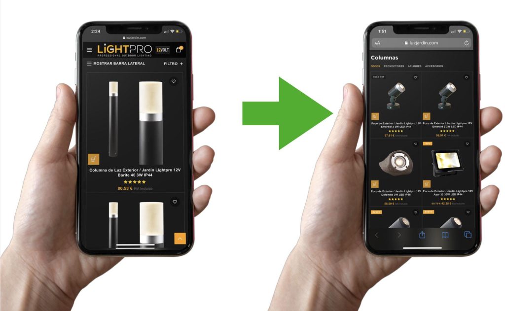
If the interface feels information-heavy, break it into columns, add images, increase spacing, and tone down the intensity of less important text.
Focus on clear goals. Remember, not everything can be the main attraction. Each page should serve a single purpose, with links guiding users to subsequent pages for additional tasks. This focused approach streamlines user navigation and enhances their overall experience on your site.
In conclusion
Creating a website that truly sells is an artful blend of understanding your audience, embracing minimalism, and maintaining consistency. It’s about making every visitor feel like the website was made just for them, using clear and concise content, and ensuring a seamless and intuitive user experience. By focusing on these key principles, you can build a website that not only attracts visitors but also turns them into loyal customers.