In the ever-evolving landscape of web design, sticky menus have emerged as a popular tool, promising seamless navigation and user convenience. But like any trend, they come with their own set of puzzles and paradoxes. This exploration takes you through the surprisingly complex world of sticky menus, unraveling their hidden challenges and revealing alternative solutions that balance user experience with functionality.
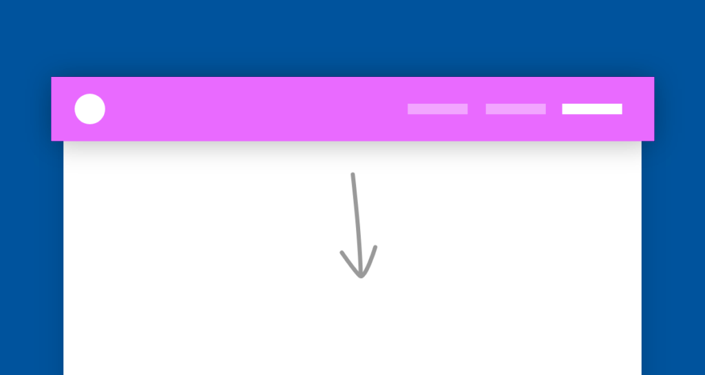
Screen Real Estate Invasion: Sticky menus, by staying fixed on the screen, can take up a significant portion of the display area. This is particularly troublesome on smaller screens like smartphones, where they can cover up a large part of the visible content, making it difficult for users to see the full page.
Content Obstruction: Sticky elements, such as a floating action button, might hide important content underneath them. This can be frustrating for users trying to access information that’s being partially or fully covered by the menu.
Zoom Quirks: When users zoom in on a webpage for a closer look, sticky menus can disproportionately enlarge and dominate the screen, leaving little space for the actual content. This can be especially problematic on mobile devices, where screen space is already limited.
Accessibility Hurdles: If a vertical sticky menu is taller than the user’s viewport, it can become difficult to access all of its items. Users might need to scroll excessively to reach menu options located at the bottom, which can be time-consuming and frustrating.
Anchor Link Limitations: Sticky menus often contain anchor links that lead to different sections of the same page. However, if a user clicks the same link twice, it might not respond the second time, creating confusion and giving the impression that the menu or website is malfunctioning.
Perceived Proximity vs. Actual Accessibility: While sticky menus are always visible and seem within reach, they can be less user-friendly for those navigating with a keyboard. Users might need to press the ‘Tab’ key numerous times to cycle through all page elements before reaching the menu, which can be tedious.
Interaction Interference: When users navigate to the top of a page using keyboard shortcuts, they might find that the focus (the active selection) lands on a link that is hidden behind the sticky menu. This can make it difficult to interact with that link or even know it’s selected.
Alternative Pathways: Moving Beyond Sticky Menus
- Shorten Pages: Address the root cause of long-scrolling pages.
- Embrace Scrolling: Contrary to popular belief, scrolling is not a problem, even on mobile devices.
- Contextual Links: Integrate relevant links within content, like subscription forms at the end of posts or CTA buttons in pricing sections.
- ‘Back to Top’ Button: Use this as a less intrusive navigation aid, but only as a last resort after exploring other options.