Brutalism in digital design is a movement that emerged quite recently as a reaction to minimalism. In essence, brutalism embodies a feeling of lightness and superiority at the same time. The main goal of this style is to break away from similar, template-based solutions in web design that have flooded the internet.
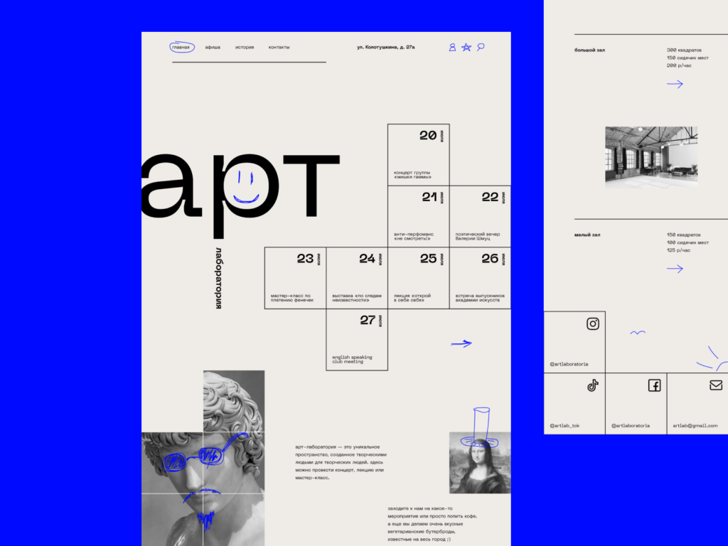
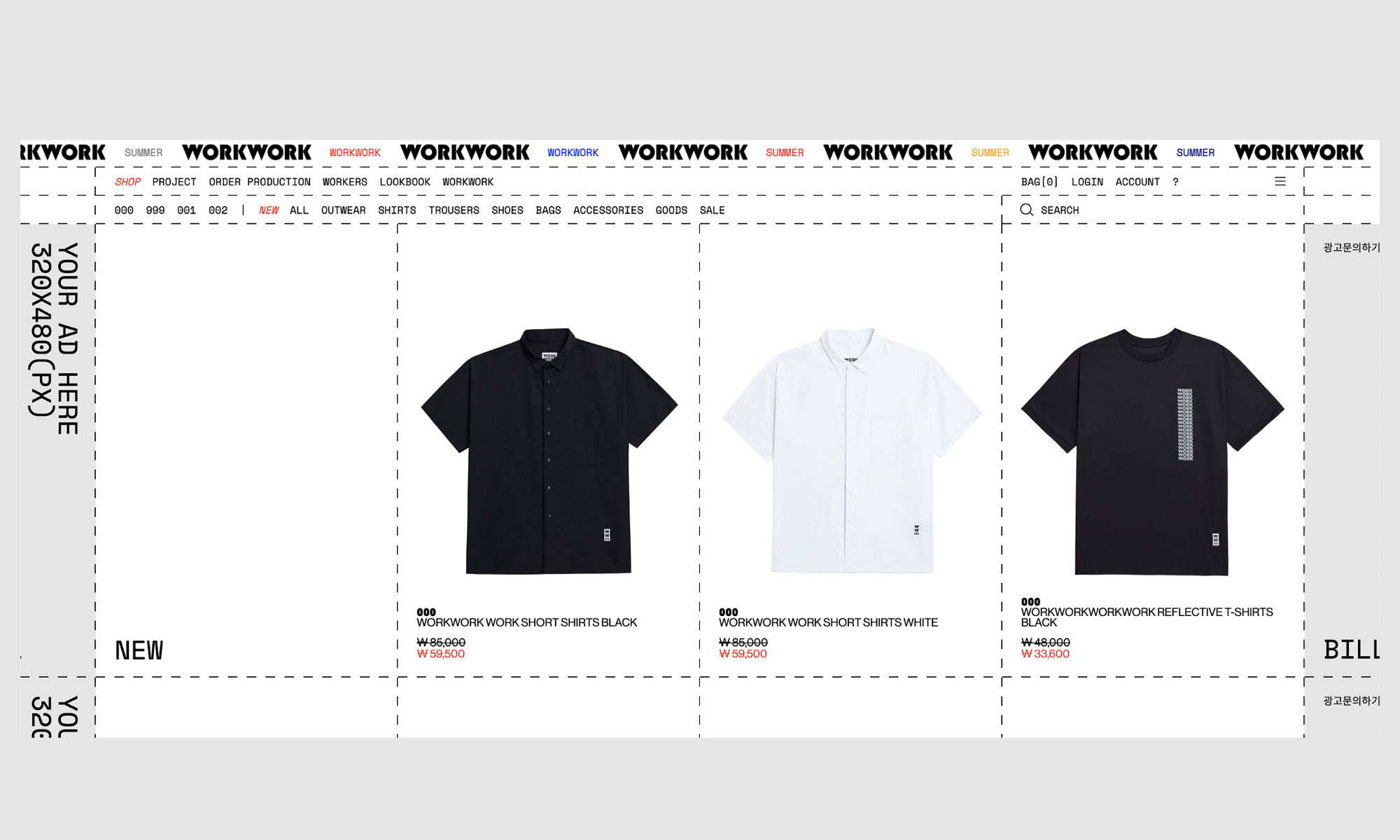
Here is an example of what a website in the brutalist style looks like:
Brutalism originally emerged in architecture between the 1950s and 1970s as a response to the abundance of unnecessary decorative elements in French architecture. The word “brut” in French means “raw,” and it derives from the word “b`eton brut,” or “raw concrete.”
The buildings that resulted from this movement were solid and massive structures that used unfinished concrete as their primary design element. They were meant to be dignified and unpretentious structures, and a way to denounce the modernist sense of aesthetics that had a superior, almost “bourgeois” spirit.
In visual design, brutalism doesn’t differ too much in terms of its characteristics. It looks bright, bold, and sometimes even daring. It features large blocks of text, contrasting colors, and bold layout grids that allow elements to overlap one another.
While the initial reaction to such a design is often tumultuous and ambiguous, or even off-putting, it does its job, bringing commercial success to your projects. Currently, brutalism in web design is transitioning from a controversial style to a mainstream one.
To understand how brutalism has gained such popularity, we must first look at its predecessor – minimalism.
Let’s explore how minimalism in interface design took off and gradually infiltrated branding, graphic design, and even illustrations. Although minimalism began in industrial and interior design in the 1970s, it didn’t dominate user interfaces until much later, and for different reasons.
Apple and Google heavily used minimalism in their interface design. Remember early Windows interfaces cluttered with hundreds of menus, buttons, and switches, and compare them to the revolutionary clean and straightforward interfaces of early Mac OS. Since then, little has changed, and any even remotely ambitious project is always compared to Apple’s products, rather than any other.
Similarly, Google produced a similar revolution when, contrary to Yahoo’s flickering and moving homepage, which made people feel sick and dizzy, the folks at Google created a white screen with a single search bar in the middle, which became an industry standard. You know where the former upstart Google is now and what happened to the former leader of the Internet, Yahoo.
Minimalism in interface design had a clear goal: to focus on what’s essential, simplify navigation, and eliminate any distracting excesses that made the internet of the 90s flicker and shimmer, causing a strong aversion.
Minimalism excelled in its role, clearing interfaces, making them more uniform, and as a result, more accessible to a broader range of people, ultimately bringing in substantial profits to the internet.
Now, after a decade-long war with the terrible design of the past, when it was practically eradicated, we face a new challenge – brand self-identification. This is where brutalism began to emerge as a challenge, albeit a good one, to the monotonous design techniques.
Brutalist interfaces are highly contrasting, with main text and important headings occupying almost the entire screen, boldly delivering the key message. In this, it is both similar and dissimilar to minimalism, performing the same task of focusing on the main message without any distracting excesses, while also achieving a second objective – attracting attention and standing out from the crowd, ultimately bringing financial success to its owner.